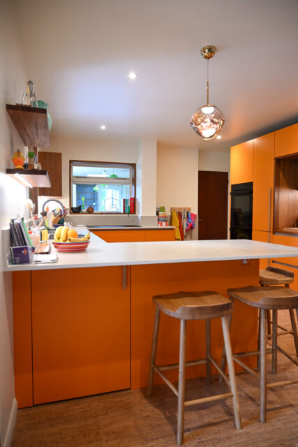
Most kitchen colour decisions default to white, off-white, or grey. Those are sensible choices, and they work. But they are not the only ones. Bold kitchen colours, handled with the same attention to proportion and material that any other design decision gets, can produce a kitchen that feels more personal and more grounded.
The question is not whether to use colour but how: where to use it, how much of it, and what sits around it. These are design decisions, and they are worth thinking through properly.
Why Bold Colour Works in a Kitchen, and Where to Use It
Colour in a kitchen works differently from colour in a living room or bedroom. The surfaces are harder, the lighting is more varied, and the room is used in a different way. Colour that reads well in a showroom under controlled lighting can look entirely different under the combination of daylight and task lighting that most kitchens live under. This is one of the reasons seeing colour samples in the actual space, or at least in the same light conditions, matters before committing.
The most manageable place to introduce a bold colour is the island or a tall unit run, rather than the full kitchen. This limits the visual weight of the colour to one element and allows it to read as a deliberate design decision rather than an overwhelming one. An island in deep green or navy against painted Shaker uppers in off-white is a combination that reads as considered precisely because the colour is placed, not spread.
In a smaller kitchen, a saturated blue on every unit can start to feel enclosed, so it is worth trying it on one element first. In a larger room with stone floors and good natural light, the same colour often sits comfortably.
The Colours Homeowners Are Choosing
Deep greens
Sage and forest green have been popular for several years, and the versions that hold up well over time are the ones that sit in the grey-green range rather than the bright or yellow-adjacent greens. Warmer, murkier greens work in kitchens with limited natural light. Cooler, more mineral greens suit spaces with good light and pale stone or concrete surfaces. Many people find these tones sit well over time because they reference natural materials.
Navy and ink blue
Dark blue in a kitchen has a long history, which is partly why many people see it as a lasting choice. Navy and ink blue work particularly well in period properties where the darkness of the colour suits the proportions of the room. They pair well with brass or warm-toned hardware, and with natural stone worktops where the veining provides enough visual movement to stop the kitchen from feeling flat.
Clay, terracotta, and warm neutrals
Clay and terracotta tones are the warm alternative to the cool greens and blues that have dominated kitchen colour for the past few years. They are harder to carry off because they are more specific, but in the right room with the right materials they can produce a kitchen that feels genuinely warm and individual. They work best with unlacquered brass, warm stone, and timber, rather than with chrome or cool-toned quartz.
Honest guidance on trends
All of the above are current. None of them is strongly tied to one moment, and they tend to last longer when the surrounding materials are chosen to suit the colour rather than to follow their own separate trend. The cabinetry is not the only thing in the room; what sits around it matters as much as the colour itself.
Two-Tone Kitchens
A two-tone kitchen pairs a bold colour on the base units or island with a neutral or contrasting tone on the wall units. It is one of the most practical ways to use a bold colour without it dominating the room, and it gives the kitchen a visual structure that reads as intentional.
The ratio matters. A kitchen where the bold colour appears only on the base units and the walls and uppers are pale will feel different from one where the bold colour is on a large island with neutral cabinets on all other runs. Neither is wrong, but the effect is quite different and it is worth testing both in a 3D design before committing.
The transition between the two tones also needs attention. A hard line between a dark base and a pale upper can look abrupt if the worktop is not considered as part of the separation. A stone or quartz worktop with some movement in it often works better than a flat-white composite, because it provides a visual link between the two tones rather than a clean cut.
For the practical guidance on cabinetry styles that suit painted finishes, the matt and painted wood finish kitchens page and the Shaker kitchens page are worth reading alongside this one.
Making Bold Colour Timeless
The choices that sit around a bold colour determine whether it feels like a considered design or quickly dated. These are the decisions that matter most.
Worktops should be chosen to suit the colour rather than to match a general trend. A deep green kitchen with white quartz can work, but it can also look sharp and cold rather than grounded. The same kitchen with honed limestone or a warm-toned granite softens the combination and gives it a more permanent feel. Pale quartz with heavy veining is a middle ground that provides visual interest without adding another strong colour to the mix.
Hardware is the detail that either reinforces the colour or undermines it. Brushed brass and warm-toned unlacquered hardware suit the greens, clays, and navies that are currently most popular. Polished chrome cools a warm colour and can make it feel harder than intended. It is worth treating as a design decision rather than a specification afterthought.
Flooring that grounds the colour rather than competing with it is the third key decision. Stone, polished concrete, warm timber, and terracotta tile all work well under bold kitchen cabinetry because they share the quality of being natural and variable in tone. A uniform mid-grey tile under a bold colour tends to look flat rather than considered.
For more on the worktop options that work best with painted cabinetry, the kitchen worktops page covers the range in detail.
Bold Colour in Our Projects
[PHOTO PLACEHOLDER: Bold colour project 1: awaiting image from NH team]
[PHOTO PLACEHOLDER: Bold colour project 2: awaiting image from NH team]
More completed projects across Cambridgeshire are available to browse on our projects page.
FAQs
Should I choose a bold or neutral kitchen colour?
Will a bold kitchen colour date quickly?
What colour goes with a bold kitchen?
Thinking About a Bold Kitchen?
Ready to Choose?
Seeing worktop materials alongside actual cabinetry samples under real light conditions is the most useful way to make this decision. Our St Ives showroom has a wide selection of worktops on view. Worktop choice is part of the design conversation, so a free design visit is a good place to talk it through.